Category: Info from Gretchen


The Final Post!

Congrats! You’ve made it through the semester of GRA 217.

On Thursday, we’ll be watching the movie Helvetica in class. For your final post, please write a few sentences about this movie. It could be something you learned, an opinion of the movie, or something that made you think.

You will also have to post a JPEG of your final website project. Please post the home page and at least one other page. (You do not have to post all pages unless you want to.)

These two posts are due Friday, April 30. Please comment on 2 Helvetica posts and 2 website posts by Sunday night.

If you are taking a floating redo for the website project, you need to post an image of your websites by next Friday, May 6. I will not be posting here again to remind you.

Also, if you have missed posts throughout the semester, you may make them up for late credit. This and any extra credit posts are due no later than Friday, May 6.

Blog Post Week 14: What I’ve Learned

This is your second to last blog assignment!

For this post, please list and explain the three most important things you have learned about graphic design in this course. These should be practical and thoughtful; silly or trivial answers will not earn points.

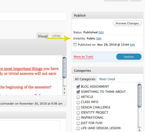
You will have to take an extra step for this assignment because I want your posts to be private. In WordPress, you must change your visibility to private. To do this, go to the upper right hand corner of your draft. This is above the publish button. Click on Edit (next to visibility – the default is set to public), and select private.

I look forward to reading your posts—we’ve come a long way since the beginning of the semester!

You will not comment on each other’s posts this week because you should not be able to see them!

As always, email me with questions.

As we move into your website projects, I would like you to spend some time looking at websites. Find an example of two websites; one good and one bad. Take a screen shot of each website and upload a picture to the blog. Also post a link to the websites you choose. (Please insert the link instead of pasting a long url…)

Compare and contrast the two website designs. What characteristics make them good or bad? Write a few sentences about each.

Post due Friday; two comments due Sunday. Hang in there…you’re closing in!

**If you are submitting your magazine project this week as a floating redo, please upload your magazine project this week as well. Refer to this post for tips on how to upload.

How to Post Your Magazine Project

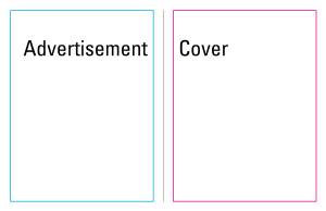
I have been getting some questions regarding how to post the magazine project to the blog. These directions should help. You will be exporting three separate JPEGS (Cover/Ad, Spread 1, and Spread 2).

1. In InDesign, go to File – Export

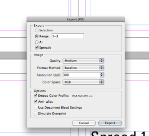
2. Save the JPEG as your Cover. When you click Save, another box will open. You need to make some changes in this box! You should change the RANGE to 2-3, and make sure SPREADS is checked. This will only export pages 2 and 3 of your document, which should be the cover and advertisement.

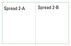
Follow these same steps, only changes the page numbers you want to export each time. The second time, you will export pages 4 and 5, and the third time you will export pages 6 and 7. You will then upload all three images to the blog.

Blog Post Week 12: Storytelling

This week, please post an image of the cover of a book or CD that tells a story. Analyze the cover and explain what information the viewer gathers just by looking at the cover. What do you notice right away? What do you notice after looking at it for a while?

Also consider how the title of the album or book works with the image.

Your magazine project is due Thursday, which means you should also post a JPEG of your magazine on Friday night.

2 comments on the album covers and 2 comments on your classmates’ magazine projects are due by Sunday night.


Blog Post Week 11: Magazines

This week, please post a picture of a magazine cover. Then describe three reasons why it is successful or unsuccessful. In your analysis you may discuss the image, typography, photography, color, size, alignment, etc.

As you post these covers and comment on your classmates’, be thinking about how you can transfer the successful characteristics to your own design.

This post is due by Friday, April 1 at 11:59 p.m. Two comments will be due Sunday night.

*If you are turning in your poster this week, you must also upload a JPEG of your poster and comment on two of your classmates’ posters.

Blog Post Week 10: Photography

This week, explore the Pictures of the Year International website. There you’ll find some of the very best work in global photojournalism. Use this opportunity to begin training your eye to spot amazing images. The Winners Gallery is a great place to start.

Post an image from this gallery (not already posted) along with a brief description of the creative devices used in this image. We will be discussing these creative devices in lecture this week.

In addition, your poster project is due on Tuesday. Please upload a JPEG of your final poster design by Friday night and comment on two of your classmates’ posts by Sunday.

Just to clarify, you have two posts due Friday (poster JPEG and photography) and 4 comments due Sunday.

I am changing this week’s blog assignment. We will not be going over creative devices in photography this week, therefore I do not expect you to write a post about it.

Instead, I want you to write about an interaction you have recently had with graphic design. It can be a picture of something visually appealing, an example of good or bad typography, design in another culture, etc. Just be sure to tie it back to the principles we’ve learned in this class. This is a very open post, so be creative.

This post is due on Friday (March 11) at 11:59 p.m. and two comments will be due on Sunday.

Blog Post Week 7: Posters

We are moving on to your third project: posters! This week, I want you to visit this website: http://www.designhistory.org/posters.html

Spend some time looking at these posters and thinking about how technology has changed the way we design. A lot of the posters on this site were created by hand, since InDesign and Photoshop did not exist.

Pick 1 of these posters and analyze the design principles used. Do you like it? Why or why not? Is it effective? If the poster was created today, would it still have the same feel?

Make sure you write down the number of the poster you are analyzing in your post. Do not analyze a poster that your classmate has already discussed! There are plenty of posters to choose from.

Feel free to post the image of the poster so people can identify what you are talking about.

Post is due by Friday night; comments by Sunday.

Blog Post Week 6: Color

I know you are all working hard to finish up your identity system, but this week we are going to turn our attention to color and poster designs. Color is a very important element in design; different colors can give your design an entirely different feel.

First, take some time looking at the color wheel.

Then, find an image (it can be a poster, magazine cover, logo, etc.) that utilizes the color principles we discuss in lecture this week. To receive full credit for this post, be sure to use the vocabulary we are using class. Be critical and concise about how color works (or doesn’t work) in your chosen design.

This week, you must also post a JPEG of your business card. These two posts are due Friday by 11:59 p.m. Your four comments (2 for color and 2 for business card) are due Sunday at 11:59 p.m.